
This Motion Branding Package for Yellowjackets: Final Season was collaboratively developed by a three-person team.
Team: Seamus O’Connor, Callie Blackwood, Yueru (Crystal) Chen
I focused on visual development and storyboarding, type design and typography treatments, and the visual execution of social media assets, while also contributing to selected cinematography prop creation, shooting, sound and music design, and post-production color grading.

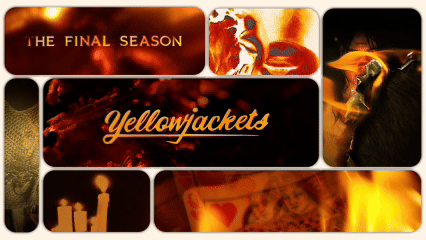
CONCEPT OVERVIEW
Our campaign for the final season of Yellowjackets explores how the past never truly stays buried. The characters’ attempts to escape their history become the foundation of our concept. Every visual represents what happens when those memories resurface and take control once again. Fire, decay, and distortion act as metaphors for guilt, denial, and shame that linger long after survival.
VISUAL LANGUAGE
All footage was captured in camera to keep the work grounded and tactile. We burned printed portraits of the characters, scattered leaves, and let fake blood drip across assets. Pieces of glass and special lenses created natural blurs and distortions that reflect fractured memory. Every imperfection feels human and unsettling, mirroring the tone of the series.

MONTAGE
TONE
The tone remains quiet but tense. Flickering visuals and empty space let the unease grow naturally. Nothing is shown directly, only suggested. Viewers feel that something is coming, that the wilderness still calls to those who once survived it.


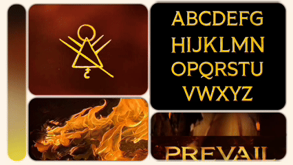
SYMBOLISM
We reimagined the show’s recurring symbols, like the forest glyph and Queen of Hearts card, by burning, carving, and distressing them. Each one appears as a damaged relic that refuses to disappear. The typography was rebuilt by hand and textured to give it grit and imperfection, making it feel like something found in the wilderness itself.


